Personal Branding
Overview
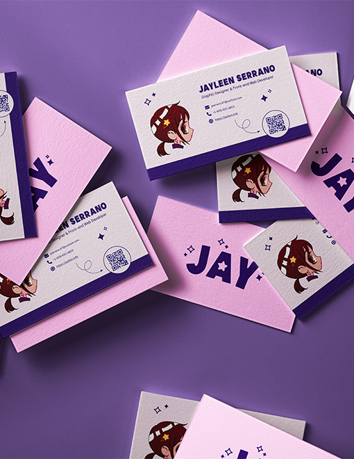
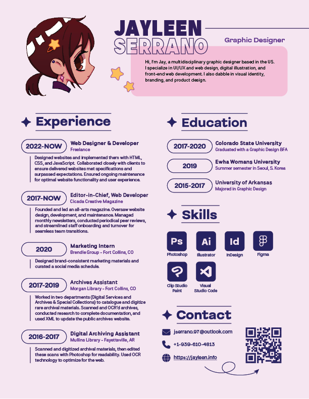
This entry encompasses how I designed and implemented this website, as well as detailing the visual identity I’ve formed to guide my collateral material, like business cards and my resume. My primary aim was to creating a memorable, playful brand with a consistent visual identity.

Style Guide
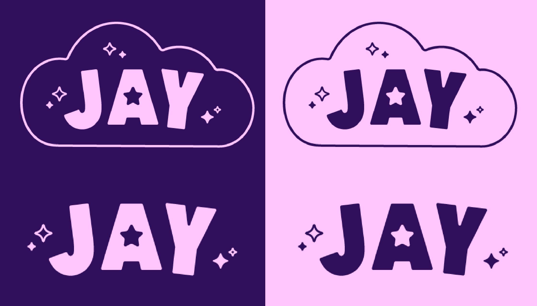
My personal branding utilizes two primary color schemes to create a light mode and a dark mode while still maintaining visual cohesion. I wanted to break away from traditional a white/black dichotomy and use something more visually lighthearted.
Design Tools
I used Illustrator to create my logo, homepage graphic, favicon SVGs, and resume. I used Photoshop to create physical mock-ups of my business card.
Tech Stack
I used Hugo to generate my website since it’s static and straightforward. I use SASS for the styling and Javascript for functionality like the gallery filter. I hosted my site on Github and deployed it with Netlify. Netlify is richly featured and allows for convenient functionality like my contact form.
Notable Features

Illustrations
I wanted to create the assets for my website to demonstrate the breadth of my creative skills. My business card and resume include one of these illustrations, created in Clip Studio Paint. I also included an image like this on my “About” page. These illustrations were created after I’d established other parts of my visual identity, like stars as a motif and pink/blue color scheme. I used my visual guide to make sure my stylized self portrait would be harmonious with the other visual elements of my branding.
I chose a “chibi” style of art to maintain a fun, lighthearted feel to my website and brand, and also as a nod to the fact that anime and manga styles of art have been very influential in my own personal development as an artist. Many of my aesthetic sensibilities were developed while consuming this type of media.
Theme Switching
As previously referenced in the Style Guide, my personal branding using two primary color schemes. I wanted to include a light mode and a dark mode to accomodate user preferences. I also coded my site to automatically select light/dark based on the user’s browser preferences. I ensured the contrast was high enough to meet web accessibility standards, and then added the toggle in an intuitive part of the screen with clear iconography.


