Finca Casa Blanca Branding
Overview
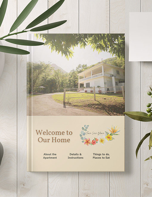
Finca Casa Blanca is an Airbnb located in Juana Diaz, Puerto Rico. The property owner tasked me with creating an informational booklet to print and distribute for guests and to refine FCB’s branding and logo design. Because FCB was located in a relatively remote area surrounded by a lot of greenery and fruiting trees, I wanted to limit the palette to earthy neutrals: primarily greens, browns, yellows, and oranges.
Design Tools
Notable Features
Logo
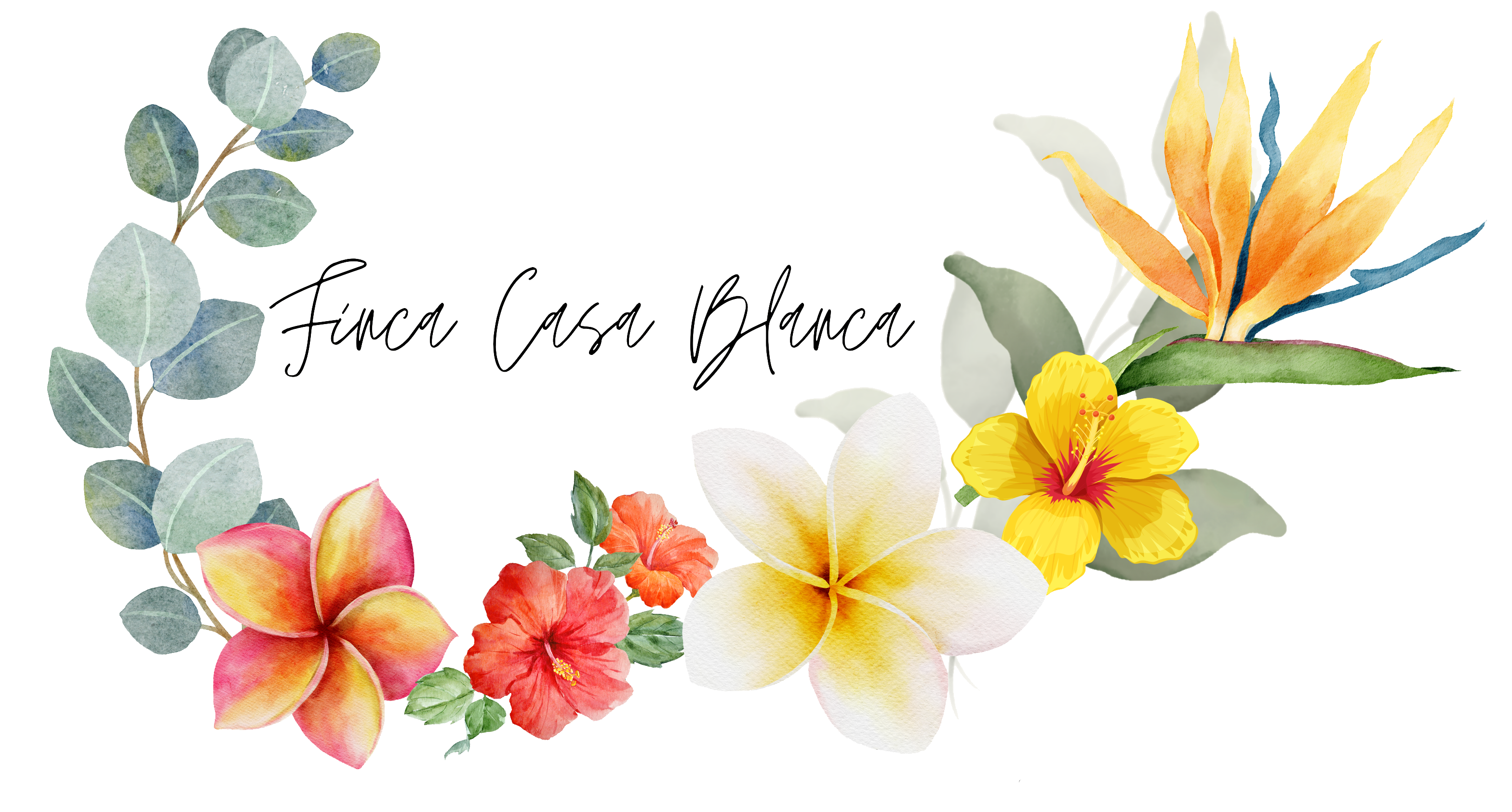
Finca Casa Blanca’s logo underwent several refinements and passed through the hands of a few different designers. The property owner wanted me to refine the logo further and help her choose between a few different prototypes. After including these prototypes on various mock-ups for business cards, we settled on a color scheme, a general design idea (asymmetric floral wreath), and a font. I thought the illustrative touch would retain the air of “classiness” and groundedness that the property owner was looking for, but the colors suggested an earthiness that was consistent with how the property was marketed. Additionally, “finca” means “farm” in Spanish, and the property is named as such due to the several fruiting plants on the property that are accessible for guests. I thought alluding to this in the logo would be a good way of establishing a clear brand identity. The property owner was happy with this final logo design, and we proceded with this as a guiding tool for the rest of the branding.


