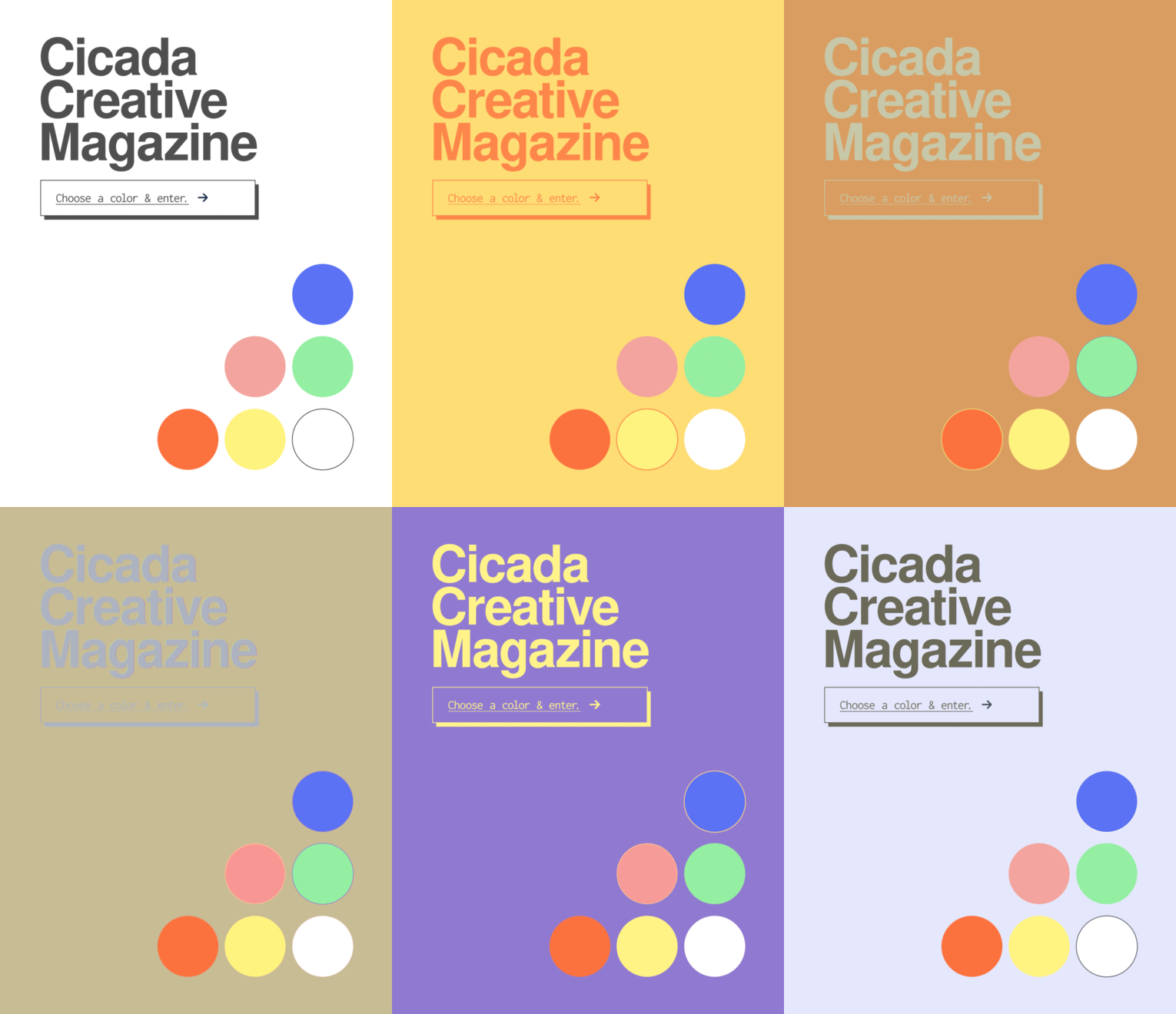
Cicada Creative Magazine
Overview
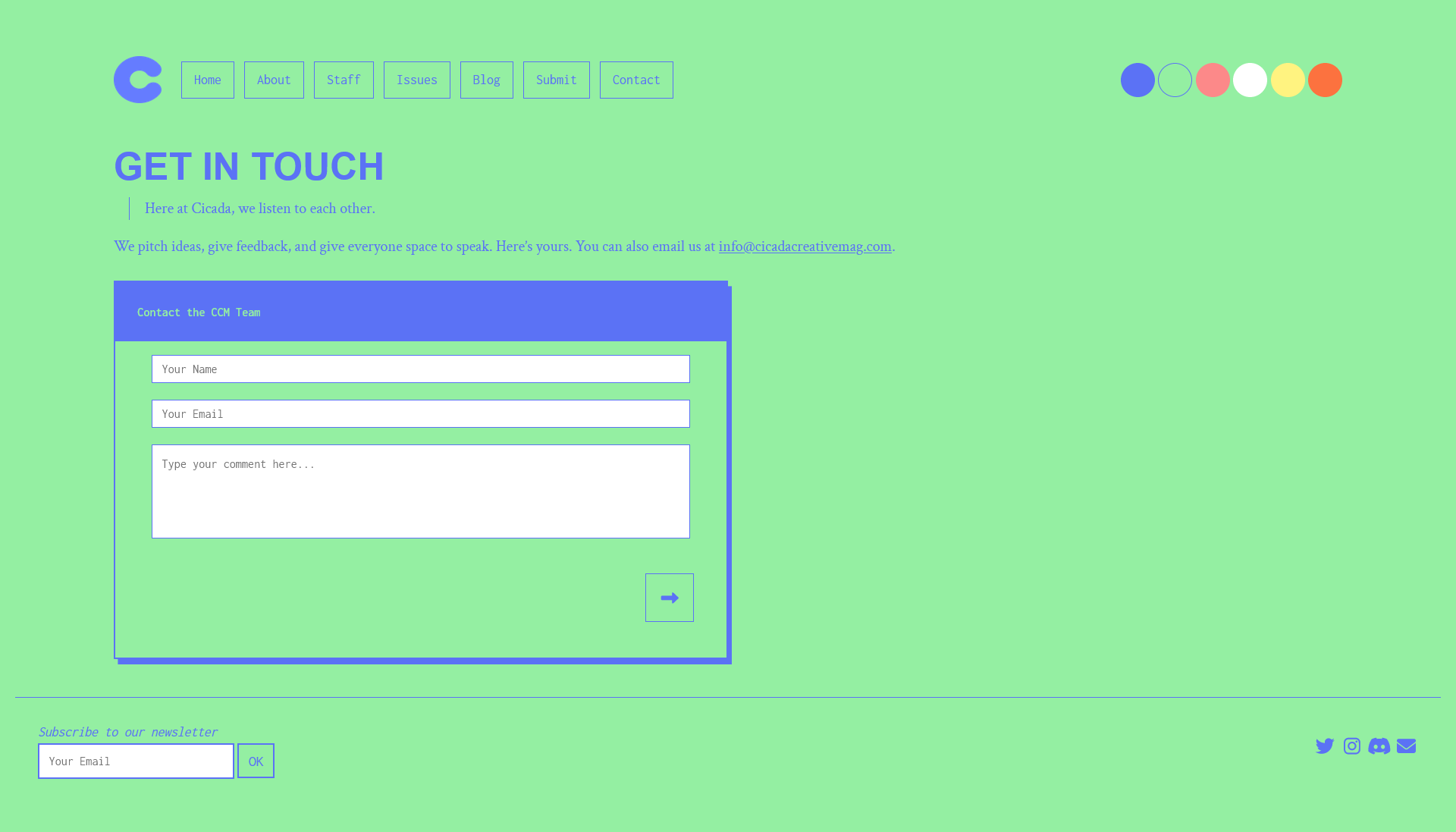
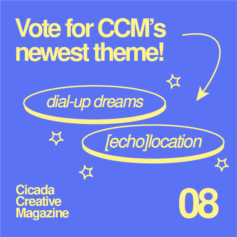
In 2017, as an undergraduate student, I noticed there were few on-campus literary magazines. The ones that did exist had rigid submission guidelines and limited who could submit based on GPA, major, etc. This felt too prohibitive to me, and so I started Cicada Creative Magazine (CCM). CCM is an all-arts publication that works to expand traditional notions of art and creativity and fosters a supportive community of creative people. You can visit the CCM website here.
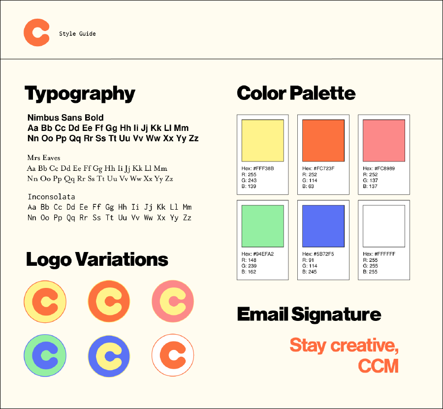
Style Guide
CCM’s original visual identity was guided by Reilly Webster. I collaborated with her on the design and advocated for elements such as a black-and-white theme to enhance accessibility for readers who may need higher contrast. Once I started developing our website, I refined our visual identity and tweaked colors, layouts, fonts, and UI/UX like our hamburger menu behavior. For example, I changed our body font from a sans serif font to a serif font in order to increase legibility for written posts and increased contrast for our color schemes.
Tech Stack
For the CCM site, my focus was on speed, cost-effectiveness, and efficiency. I decided to use a a static site generation stack to achieve these goals.
I used Hugo as our static site generator for its incredibly fast build time. Some of its features, such as image processing and fingerprinting, were of particular interest to CCM since we host so many images on our site. I also used the front-end framework, Bootstrap, to ensure a responsive user interface that looks good on any screen. But because CCM has a very distinct visual language and identity, SASS was useful in streamlining and maintaining our styles. I added some additional Javascript for user interactivity, like theme toggling and lightbox galleries. Our repository is hosted on Github and then finally deployed with Netlify. Our deployment process is smooth and fast thanks to Netlify’s serverless capabilities and seamless integration with Github.
Notable Features
Over time, I’ve implemented a number of notable features for CCM. These include marketing campaigns, design overhauls, etc.
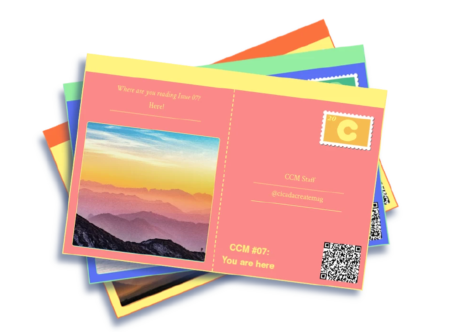
Postcard Generator
Our theme for Issue 07 of CCM was ‘You are here.’ Our branding was oriented around maps, wayfinding, and travel. I thought it would be interesting to launch a marketing campaign that included an interactive postcard generator that asks where the reader was when they read Issue 07. They could then digitally send this postcard via social media, and we’d repost it. The postcard included a QR code that linked to our issue and allowed users to attach an image to show where they were. This led to a lot of really interesting postcards and boosted engagement for Issue 07. I implemented this with vanilla Javascript that played off our theme switching. I also created stamps that toggled with the themes, similar to the logo. This link is still live here.
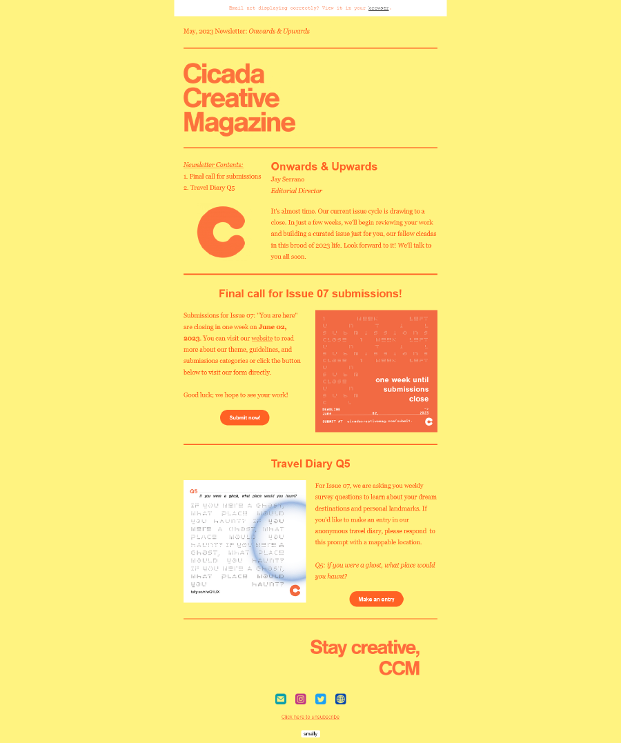
Newsletter
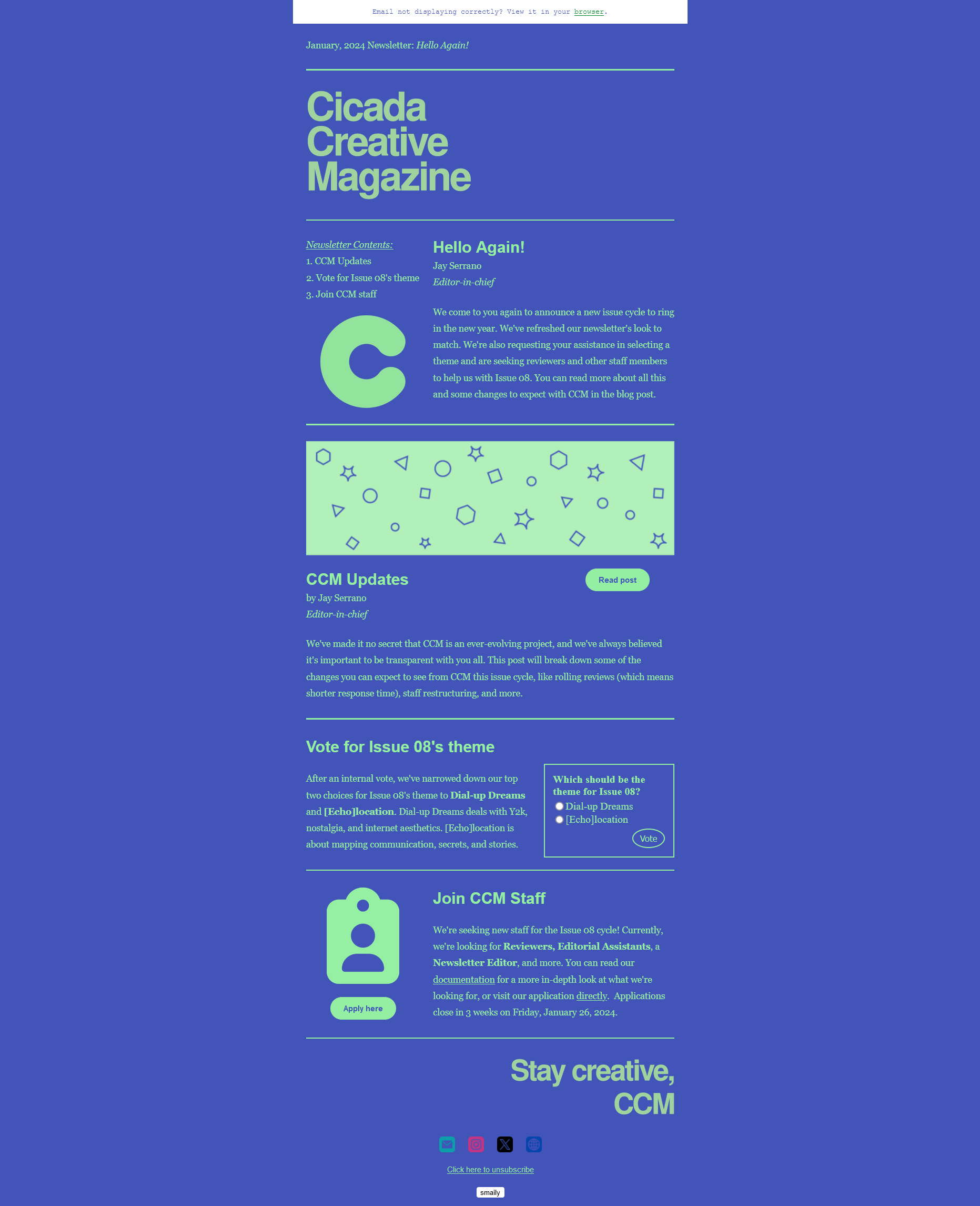
Two staff members thought it would be a good idea to implement a monthly newsletter with staff-contributed blog posts and organizational announcements. Initially, they were using templates provided by Mailchimp. When I got a chance, I redesigned the newsletter and switched our service to Smaily, which allows for a great degree of customizability. I decided our newsletter should change color schemes from issue to issue to clearly signify changing “cycles.” The newsletter works in tandem with our blog, which was another major reason I chose Hugo to generate our site. It features content from staff, but may expand to include submissions from the public as well.
Blog
As previously mentioned, we publish a newsletter once a month. Contained within this newsletter, we typically have one or two blog posts that are written and copyedited by staff. Once a month, a staff member proposes a theme and opens blog post sign-ups. Members can then propose a premise for a blog post, write it, and allow a different member to edit it. A different staff member creates an illustration based on the post content. After the post is polished, I publish it on our website and include it within the newsletter. Our blog has a comment section powered by HTMLCommentBox and includes pagination using a modified version of Hugo’s base paginator functionality. Our blog is live on our website here.
Issues
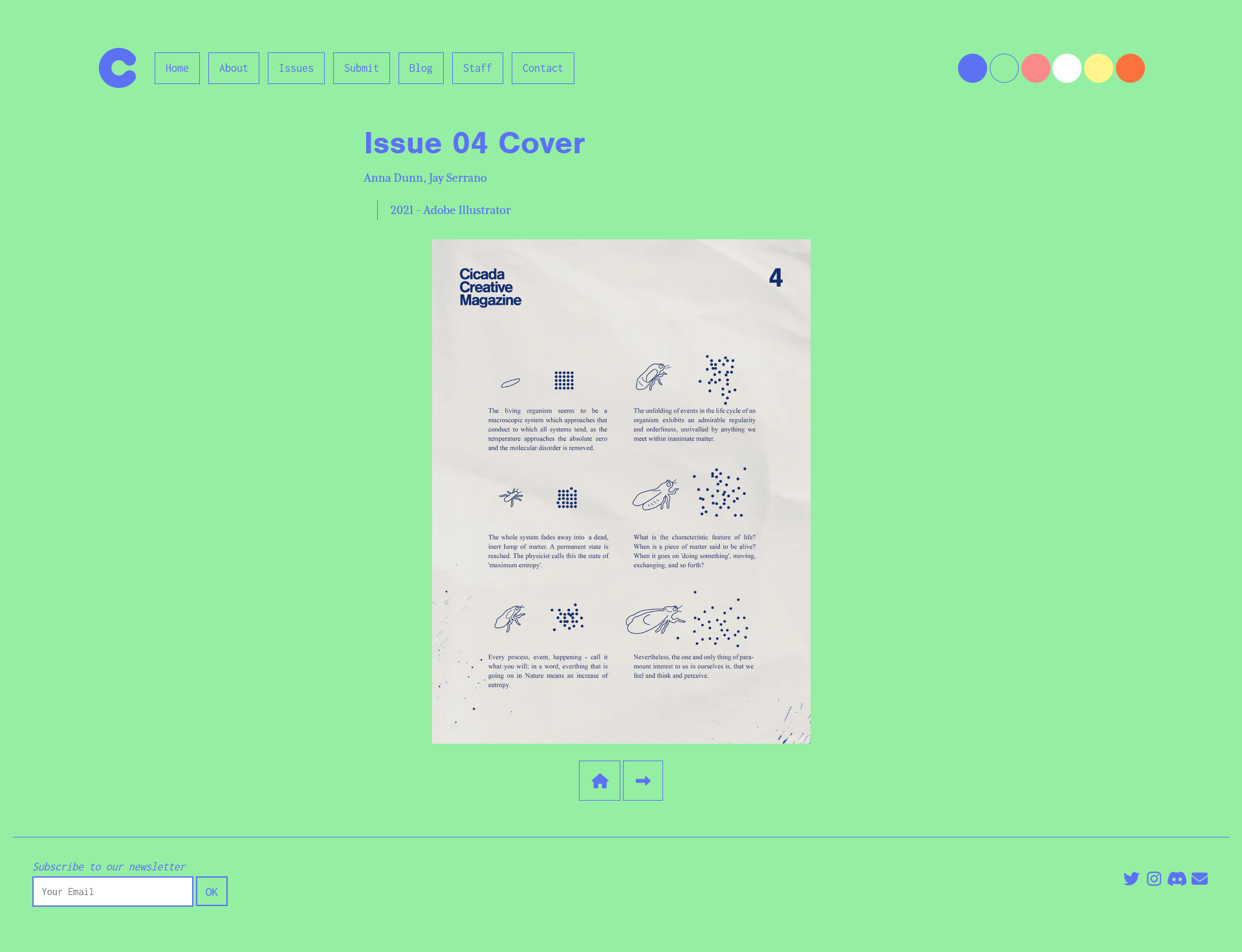
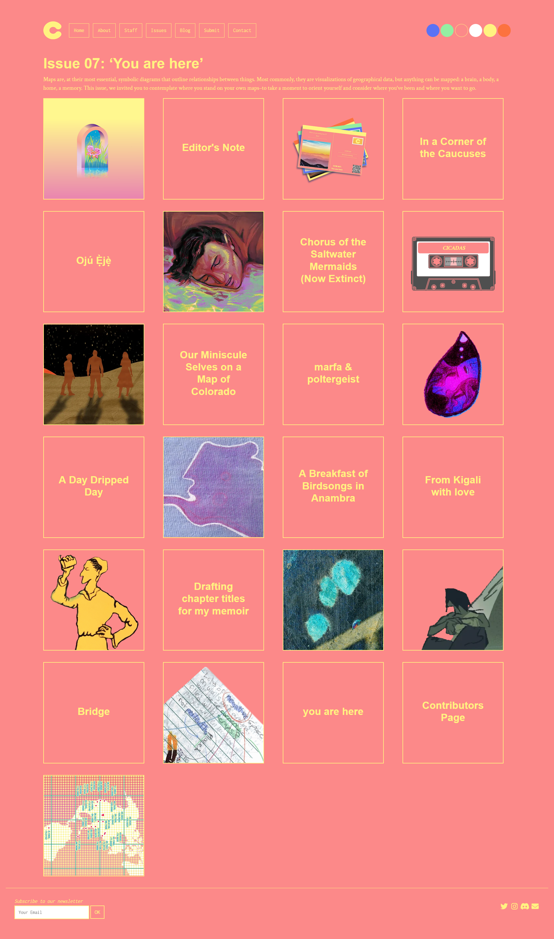
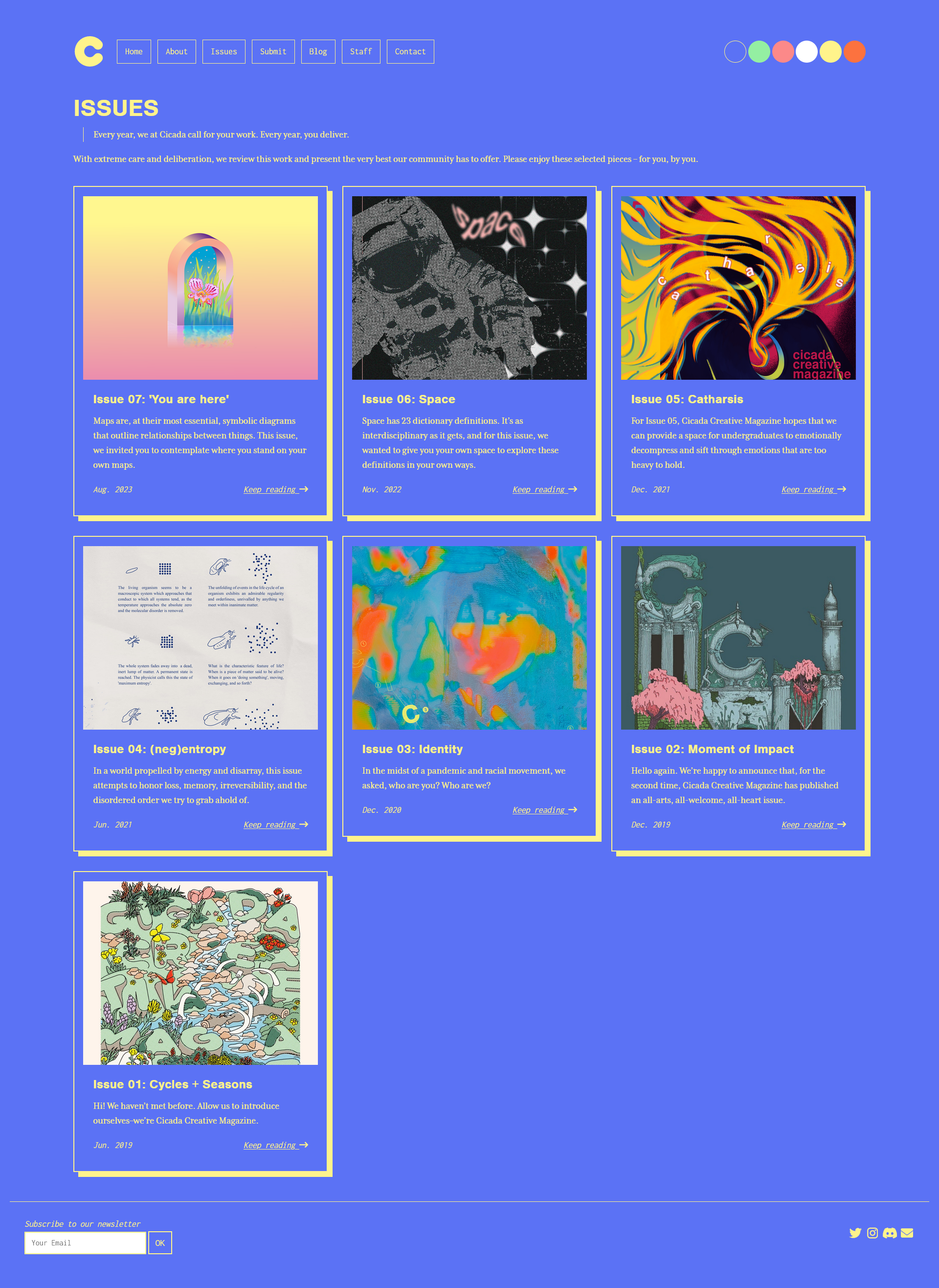
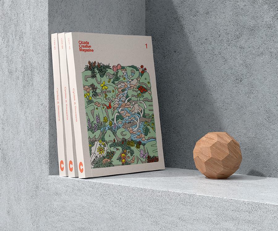
Our issues are arguably the most notable element of our publication. We publish once to twice a year after gathering submissions from the public and engaging in an internal review cycle. Displaying these with Hugo was initially challenging, but leveraging Hugo’s powerful ‘type’ method (which reads the page type from a markdown file’s front matter), I created issue pages that feature tiled grids with a mixture of different thumbnail types. We currently have three different thumbnail types, which are for art pieces, audio pieces, and writing pieces. Video pieces typically use art thumbnails. Some thumbnails are transparent and some are cropped squares. We used to manually crop and compress all images, which was a time-consuming process. Instead, we now use Hugo to fingerprint and crop these images to optimize them for slower connections.
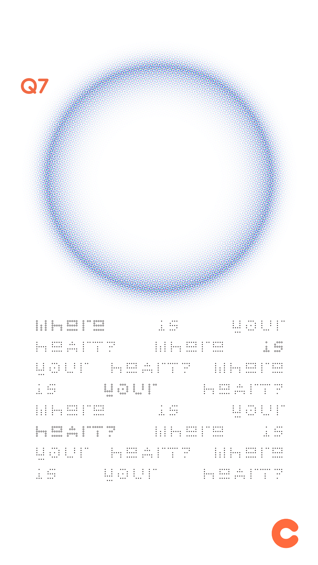
I’ve also created mockups of the magazine to get a better idea of how it will look when we print.
Error: Image not found.
Documentation
In January 2023, I created a documentation website for CCM. This is intended to be a supplemental learning tool for new staff, a reference material for all staff members, and a potential resource for anyone interested in joining or submitting to CCM. I noticed that as we changed as an organization, it became harder to keep track of what our policies were. As CCM shifted from an in-person organization to a remote one, I decided we needed comprehensive documentation that changes as we do. This became especially clear as our staff changed over time. Prior staff isn’t always available to comprehensively onboard new staff, so keeping instructions for new members ensures the longevity of our site. Although I produce the bulk of the documentation at this time, I also solicit information from staff so they can assist in the creation of healthy, active documentation.


